Sunday, January 31, 2010


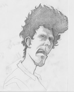
There! I finally got the sketches to load right side up! I have uploaded these pics like five times and because i scanned them upside down the upload thing was giving me trouble. anyway here are sketches of tom waits for a caricature that i am about to do of him. im also doing one of Frank Oz but honestly Tom Waits is more fun to draw.


Drawings of Tom Waits for my caricature of him. I will probably try to blend these two drawings of hi in to a sort of two heads on one body sort of thing. make him look like he is flipping out or going spastic or something. i have some more sketches that i will post but the keep loading upside down so i'll see if i cant fix that.

Tuesday, January 26, 2010


These two are works in progress. in fact i am going to almost completely redo the first one. that one is a poster / calendar illustration for the savannah humane society. the illustration is supposed to be of people that either look like or conceptually go with their animals. i chose to do a punk guy with a hedgehog instead of spiky hair. i think i'm going to get rid of the woman and the brick wall and open up the space. maybe move him down and a little back . . . we'll see. the other one is a beer label for "arlington ale". the guy that i did a mural for last summer (check older posts) is thinking about starting a brewery in the basement of his grocery store and asked if i was interested in making a label for it. this isn't official or any thing just for fun but if you are reading this devon then SURPRISE!!!! i wanted to do something different than just the standard "here is our name and some fancy looking border" kind of label so i told the story of the beer from production to good times with friends. i went with the graphic black white and yellow to make it stand out despite being so detailed. this one is almost done im going to look for a better font that's easier to read. i think i will also add a little paint and or colored pencil onto the brewery distilling vat things to make them more copper colored and a little pencil to the cheers portion. i think i'll also make the beer a little more orange so it doesn't look so much like . . . yea.

Friday, January 22, 2010


Here is the other drawing i did. or rather and unfinished scan of the other one. this is before i rendered the hair and beard, like i said in the earlier post i will put up the finished piece as soon as i get it back from Prof Rogers but for the time being here is my caricature of . . . henry(?).


Thursday, January 21, 2010


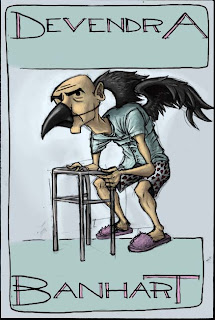
This was just something i did for fun over the break that i never got around to putting up. it was an alternative thumbnail for the devendra banhart poster i did a while back. i went with the one with the hair of tiny floating people stuck to a bald guy's head, but i still kind of liked this one so i colored it in photoshop just for the heck of it. wooo. just to clarify what is going on dev b-hart has a cd called cripple crow.




this here is my first post in a while but should also be the first of MANY in the coming weeks. with almost as many projects as there are days in the week, PER week; i should have my hands full in the coming month and a half. however from the looks of things it will shape up to be an exciting quarter. i have a newfound love in the art world and its name is caricature! at first i was a bit daunted by the prospect of being graded on the level of likeness that we got in our drawings and pretty unsure of my skills, but the class is turning out to be very laid back and loads of fun. its not often that we get a class where we can just sit back and draw the other students around us. (you'd think it would be right?) anyway this is one half of my first caricature assignment. we had to do two drawings, one of our classmates in the style of the late great david levine or al hirshfeld and another in a more blocky art deco-y style more like robert risko. this was my attempt at the more risko-y style. i found it was much less natural to me than drawing more naturalistically but i think this one was much more fun both to do and to look at than the other one which i will post up as soon as i get it back from being graded.