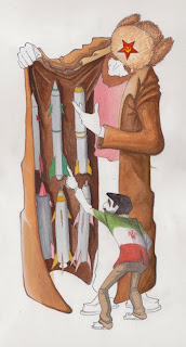
 a half painted editorial thing about russia selling missiles to iran. hopefully the little guy looks like ahmedinejad but if not thats ok, im doing another caricature of him for my other class i just need to scan in the drawing i did of it.
Thursday, February 25, 2010


Sunday, February 21, 2010

Saturday, February 20, 2010

Thursday, February 18, 2010

Wednesday, February 17, 2010


its like 4:15 and this is what i have done so far on the house painting. its due for crit tomorrow but the finished piece isn't due till monday. sleep is good for my sanity so i'll just finish this during the weekend. its getting there though i am happy with where it is going . . . (to be continued.) oh crap! i forgot to redraw his chair!
Tuesday, February 16, 2010

Here is a working version of the babe ruth drawing. running out of time and i have to start on the hugh laurie drawing so this is what i will bring to crit tomorrow. its due on monday so i will tweak it a bit and make changes over the weekend. his face needs more work and the bat needs color . . . .


Sunday, February 14, 2010


Here is the space junk thing as a more detailed value comp. no matter what i do i am going to keep the rendering more graphic and try to stick to shapes of value but i am wondering whether i should have the piece be dark with spots of light, light with spots of dark or a middle tone with highlights and shadows. ugh. decisions decisions. i think i am drawn towards the last one but i guess we will see . . .
Saturday, February 13, 2010

 Here is a thumb / color comp for my first "editorial" assignment for portfolio. an editorial illustration is one that usually accompanies an article in a magazine and usually implies a politically themed illustration. there is no real article for this one but its about the absurd amount of junk we have floating around our planet. not including the 500 operating satellites up there are 8000 other man made objects and thats not including the 26000 that have already lost orbit and burned up in the atmosphere since the 50's and 60's. not trying to get preachy but we have already trashed the planet and it seems that we are now working our way out to the rest of the solar system. it was originally going to be the moon that you saw in the middle of the "clearing" as if you were looking up at the sky and it was filled but i think its better if you are looking down on the earth and your view is blocked. just for fun im going to add lots of fun hidden things floating around in orbit. i want to do this as a painting but once again due to time constraints i will probably end up doing it on the computer. we'll see . . .
 At long last here is the final for this drawing. It has been done for a while but i haven't gotten around to scanning it until just now. Also i recently learned that his name is actually Erik Riley, not Henry. here is a link to his site.
Wednesday, February 10, 2010


Both of these are 99% done. ok maybe 97 or 8 but they are really almost there. just need to tweak the type placement and all that good stuff. (oh yeah, i use professional lingo all the time) Any truly hardcore fans of mine (all 3 maybe 4 of you) may notice that i have DRASTICALLY changed the color scheme of the top poster. (see below for past versions) that was an idea of my professors that i am still not totally sold on. it doesn't look bad but i liked the monochromatic thing that was going on. at the end of the day she is the "art director" but i may go back and quickly do another version for myself. tell me world what do you think?
Thursday, February 4, 2010

Tuesday, February 2, 2010

Monday, February 1, 2010


These are pics in progress of a poster i am doing for the Hilton Head Piano Competition. Every year the organization holds a competition for SCAD students to make a poster for them. The winner gets 1000 dollars and some percentage of money from prints of the poster they sell. I know that i have already done a poster that looks much like this but i thought the concept was pretty solid for this (more so than on the greenland poster ((see older posts))) If it isn't immediately obvious the big shape that doubles as a piano is Hilton Head Island. It is pretty distinctively shaped like a tennis shoe (or a piano). As i am headed right now i will add more textures and shape-y stuff around the outside to kind of vignette it and i still need to give the guy color. although i kind of like him as he is. maybe i'll just give him value and keep it monochromatic. I dont know but at any rate I like the top one the best out of the three, the middle one doesnt have enough contrast and the third one has too much and focuses on the island more. The words will go in the bottom right corner. In previous years they always seem to choose pieces that are just a painterly picture of a piano or a piano on a sweeping abstract landscape of some sort, so maybe i wont get picked because i'm trying something different but i really like where this is going so maybe not. lots of maybes . . . To help my chances of success i have decided to do TWO pieces for this competition. i know that's crazy-talk with all of the work that i have anyway but, what can i say. my second piece (see below) is much more simple and graphic in nature.

in thumbs, while trying to avoid concepts that simply involved a piano on a vista, i wanted to convey what the competition was really about, bringing people together to play piano. i wanted the keys to act as a sort of zipper between the two piano shapes connecting them and giving a little bit more interest to an otherwise static image. i suppose you could say that the yin yang thing has to do with the fact that it is a competition between the good and evil forces in the professional piano world but it really just spawned out of them being a a black and white piano in that sort of shape to begin with. i think it adds something but i may take it out. i will switch out the drawing for the half painted painting as soon as i scan it tomorrow. . . not that anyone will read this until then .. . .
Sunday, January 31, 2010


Drawings of Tom Waits for my caricature of him. I will probably try to blend these two drawings of hi in to a sort of two heads on one body sort of thing. make him look like he is flipping out or going spastic or something. i have some more sketches that i will post but the keep loading upside down so i'll see if i cant fix that.
Tuesday, January 26, 2010


These two are works in progress. in fact i am going to almost completely redo the first one. that one is a poster / calendar illustration for the savannah humane society. the illustration is supposed to be of people that either look like or conceptually go with their animals. i chose to do a punk guy with a hedgehog instead of spiky hair. i think i'm going to get rid of the woman and the brick wall and open up the space. maybe move him down and a little back . . . we'll see. the other one is a beer label for "arlington ale". the guy that i did a mural for last summer (check older posts) is thinking about starting a brewery in the basement of his grocery store and asked if i was interested in making a label for it. this isn't official or any thing just for fun but if you are reading this devon then SURPRISE!!!! i wanted to do something different than just the standard "here is our name and some fancy looking border" kind of label so i told the story of the beer from production to good times with friends. i went with the graphic black white and yellow to make it stand out despite being so detailed. this one is almost done im going to look for a better font that's easier to read. i think i will also add a little paint and or colored pencil onto the brewery distilling vat things to make them more copper colored and a little pencil to the cheers portion. i think i'll also make the beer a little more orange so it doesn't look so much like . . . yea.
Friday, January 22, 2010


Thursday, January 21, 2010

This was just something i did for fun over the break that i never got around to putting up. it was an alternative thumbnail for the devendra banhart poster i did a while back. i went with the one with the hair of tiny floating people stuck to a bald guy's head, but i still kind of liked this one so i colored it in photoshop just for the heck of it. wooo. just to clarify what is going on dev b-hart has a cd called cripple crow.


this here is my first post in a while but should also be the first of MANY in the coming weeks. with almost as many projects as there are days in the week, PER week; i should have my hands full in the coming month and a half. however from the looks of things it will shape up to be an exciting quarter. i have a newfound love in the art world and its name is caricature! at first i was a bit daunted by the prospect of being graded on the level of likeness that we got in our drawings and pretty unsure of my skills, but the class is turning out to be very laid back and loads of fun. its not often that we get a class where we can just sit back and draw the other students around us. (you'd think it would be right?) anyway this is one half of my first caricature assignment. we had to do two drawings, one of our classmates in the style of the late great david levine or al hirshfeld and another in a more blocky art deco-y style more like robert risko. this was my attempt at the more risko-y style. i found it was much less natural to me than drawing more naturalistically but i think this one was much more fun both to do and to look at than the other one which i will post up as soon as i get it back from being graded.
Thursday, November 5, 2009
 Ok i know what you're thinking. But i can explain. This is the first part of my third painting assignment (he still has the second part, not giving back work seems to be a thing with my painting prof.) We were supposed to do an entire painting without the use of a brush. it wasn't required to be representational but the orange circle that ended up in the middle of my project had a swoop across the top and a rectangular portion at the bottom. i took one look at it and said "damn, i guess i have to paint hitler now." the project also required that we weave another piece of paper into our painting. ridiculous and not to mention gaudy and several other things but doing ugly pointless things to a perfectly good piece of art seems to be a thing with the painting dept. i tried to make it as subtle as possible and keep it limited to his blazer but he still kind of looks like a car dealership salesman. i dont know what that says about WW2 and the holocaust but there it is . . . there seems to be something that was stuck to the glass of the scanner in the bottom right of the pic. at some point i will re scan it but its not too much in the way now. i think its tape or something.
 Everybody loves dinosaurs!! Especially me at age 5. (I know what you're thinking sarah) Project three for acrylics class was a lot of fun. The assignment was to do a painting using Gilbert Stone's process. basically slowly building up value with white on top of a colored ground, then quickly glazing in local color and darks. Plus, i got to paint dinosaurs. I think i need to clean up the edge but other than that i am really happy with this one. maybe i just love dinosaurs . . . . . . DINOSAURS!!!!!!!!
 Its funny, for my second painting project (i still haven't gotten my first one back) we were supposed to do a painting, which i did, then BACKWARDS ink it by painting with white gouache where we dont want ink. Then paint the entire thing with black ink and then wash it off. I can usually find things to learn from a project even if i don't agree with it, and im not one to usually complain but come on! the painting looked good before the white gouache killed all the color and contrast (and wasted a twenty dollar tube of paint). If i wanted the thing to look like a block print why wouldn't i just DO a block print and paint on top, saving my self a lot of time and money. now i have to go back and cover up the damage that the requirements of the project did. the painting dept. seems to work backwards from the illustration dept. in that they spend as long as they can on their work and make up meaning later rather than working quickly towards a preset goal. phew. . . that class gets me worked up. but thats another story. not like its really a portfolio piece anyway but i would like to go back and fix the painting if not just for the jellyfish which were fun to draw.

Ok haven't posted for a while but what can i say my scanner is out of commission and im far from a comp lab. The two paintings below are practice samples for my second acrylic tech. project. It involves using a pencil or charcoal underdrawing to quickly turn out a painting. pretty useful i think. I think the raccoon/pig guy is cool and i might go back and work on him a little more. I like the big monkey man too but i think he is good as he is. As for the final piece, the little sign on the door says back in fifteen. Just a few more little highlights one the monkey and floor and i should be done with it.


Friday, October 9, 2009


These are two of the practice samples i did for my "plein air" painting project for acrylic techniques. Neither are really finished due to weather conditions (first rainy then waaayyy to hot but such is savannah) but the first is of my favorite coffee shop (gallery espresso) and the second is of some buildings near Morris Hall. (the illus. building) i dont know how i feel about painting ouitside just yet. it certainly is much harder than painting inside and it doesnt lend it self well to my "ok ill work for fifteen minutes then go make myself some coffee" mentality that i have. but its nice to just be sitting out there and working. its a little like doing the mural in that you have tons of random people just looking over your shoulder and trying to talk to you. i definitely wouldn't mind getting better at it in the long run even though i doubt i;ll be doing much plein air painting as an illustrator.
Tuesday, September 1, 2009

Monday, August 17, 2009
 Ok so since this is technically a sketch blog i suppose i should post up some sketches from time to time and not just finished work. here are some sketches for the next part of the activity book for safe kids. the page is going to be part of a coloring book and will show what sorts of vechiles one may encounter on the roadway. i have to do it in the same style as i did the cover so the guy on the left middle was just for fun.

The second project I'm working on at safe kids is renewing their activity book on pedestrian safety. This is the cover minus the titles and logo. No this isn't my usual style, but i am working this way because i have to copy the style of an illustrator who did some work for safe kids a while back. i did everything except for the lady and the two kids. The illustrators name is John Worthen (i think thats spelled right). I have no other information on him and I can't find a website for him, so if this is somehow copyright infringing he can just know that I'm not getting paid for this job. All things considered, i like working in this more simplified style, maybe i'll try to do more with it now that I'm getting to know illustrator more.

Tuesday, August 11, 2009
 Here is the first illustration from my internship at safe kids. It's for CPS (child passenger safety weesk) which is sometime in september. They wanted an activity sheet for kids to do so we made a "find whats wrong with this picture" page. I did the drawing and the Graphic Designer here did the layout.
Saturday, July 25, 2009
 I forgot to add this in any of the pics of the mural. this is on the overhang above the right side of the wall. i was up on the ladder painting the ceiling blue when it occured to me that Michalangelo must have had a hell of a time painting the sistine chapel. one thought led to another and i ended up at this. i called it the creation of sam adams.
Subscribe to:
Posts (Atom)