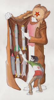
 a half painted editorial thing about russia selling missiles to iran. hopefully the little guy looks like ahmedinejad but if not thats ok, im doing another caricature of him for my other class i just need to scan in the drawing i did of it.
Thursday, February 25, 2010
Sunday, February 21, 2010

Saturday, February 20, 2010

Thursday, February 18, 2010

Wednesday, February 17, 2010


its like 4:15 and this is what i have done so far on the house painting. its due for crit tomorrow but the finished piece isn't due till monday. sleep is good for my sanity so i'll just finish this during the weekend. its getting there though i am happy with where it is going . . . (to be continued.) oh crap! i forgot to redraw his chair!
Tuesday, February 16, 2010

Here is a working version of the babe ruth drawing. running out of time and i have to start on the hugh laurie drawing so this is what i will bring to crit tomorrow. its due on monday so i will tweak it a bit and make changes over the weekend. his face needs more work and the bat needs color . . . .


Sunday, February 14, 2010


Here is the space junk thing as a more detailed value comp. no matter what i do i am going to keep the rendering more graphic and try to stick to shapes of value but i am wondering whether i should have the piece be dark with spots of light, light with spots of dark or a middle tone with highlights and shadows. ugh. decisions decisions. i think i am drawn towards the last one but i guess we will see . . .
Saturday, February 13, 2010

 Here is a thumb / color comp for my first "editorial" assignment for portfolio. an editorial illustration is one that usually accompanies an article in a magazine and usually implies a politically themed illustration. there is no real article for this one but its about the absurd amount of junk we have floating around our planet. not including the 500 operating satellites up there are 8000 other man made objects and thats not including the 26000 that have already lost orbit and burned up in the atmosphere since the 50's and 60's. not trying to get preachy but we have already trashed the planet and it seems that we are now working our way out to the rest of the solar system. it was originally going to be the moon that you saw in the middle of the "clearing" as if you were looking up at the sky and it was filled but i think its better if you are looking down on the earth and your view is blocked. just for fun im going to add lots of fun hidden things floating around in orbit. i want to do this as a painting but once again due to time constraints i will probably end up doing it on the computer. we'll see . . .
 At long last here is the final for this drawing. It has been done for a while but i haven't gotten around to scanning it until just now. Also i recently learned that his name is actually Erik Riley, not Henry. here is a link to his site.
Wednesday, February 10, 2010


Both of these are 99% done. ok maybe 97 or 8 but they are really almost there. just need to tweak the type placement and all that good stuff. (oh yeah, i use professional lingo all the time) Any truly hardcore fans of mine (all 3 maybe 4 of you) may notice that i have DRASTICALLY changed the color scheme of the top poster. (see below for past versions) that was an idea of my professors that i am still not totally sold on. it doesn't look bad but i liked the monochromatic thing that was going on. at the end of the day she is the "art director" but i may go back and quickly do another version for myself. tell me world what do you think?
Thursday, February 4, 2010

Tuesday, February 2, 2010

Monday, February 1, 2010


These are pics in progress of a poster i am doing for the Hilton Head Piano Competition. Every year the organization holds a competition for SCAD students to make a poster for them. The winner gets 1000 dollars and some percentage of money from prints of the poster they sell. I know that i have already done a poster that looks much like this but i thought the concept was pretty solid for this (more so than on the greenland poster ((see older posts))) If it isn't immediately obvious the big shape that doubles as a piano is Hilton Head Island. It is pretty distinctively shaped like a tennis shoe (or a piano). As i am headed right now i will add more textures and shape-y stuff around the outside to kind of vignette it and i still need to give the guy color. although i kind of like him as he is. maybe i'll just give him value and keep it monochromatic. I dont know but at any rate I like the top one the best out of the three, the middle one doesnt have enough contrast and the third one has too much and focuses on the island more. The words will go in the bottom right corner. In previous years they always seem to choose pieces that are just a painterly picture of a piano or a piano on a sweeping abstract landscape of some sort, so maybe i wont get picked because i'm trying something different but i really like where this is going so maybe not. lots of maybes . . . To help my chances of success i have decided to do TWO pieces for this competition. i know that's crazy-talk with all of the work that i have anyway but, what can i say. my second piece (see below) is much more simple and graphic in nature.

in thumbs, while trying to avoid concepts that simply involved a piano on a vista, i wanted to convey what the competition was really about, bringing people together to play piano. i wanted the keys to act as a sort of zipper between the two piano shapes connecting them and giving a little bit more interest to an otherwise static image. i suppose you could say that the yin yang thing has to do with the fact that it is a competition between the good and evil forces in the professional piano world but it really just spawned out of them being a a black and white piano in that sort of shape to begin with. i think it adds something but i may take it out. i will switch out the drawing for the half painted painting as soon as i scan it tomorrow. . . not that anyone will read this until then .. . .
Subscribe to:
Comments (Atom)