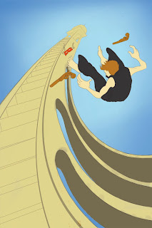
 I forgot to add this in any of the pics of the mural. this is on the overhang above the right side of the wall. i was up on the ladder painting the ceiling blue when it occured to me that Michalangelo must have had a hell of a time painting the sistine chapel. one thought led to another and i ended up at this. i called it the creation of sam adams.
Saturday, July 25, 2009
I forgot to add this in any of the pics of the mural. this is on the overhang above the right side of the wall. i was up on the ladder painting the ceiling blue when it occured to me that Michalangelo must have had a hell of a time painting the sistine chapel. one thought led to another and i ended up at this. i called it the creation of sam adams.


Bum ba na na buh bum ba na na na na na! the mural is finished! it only took me a month but its finally done. here are some pics of the little people dancing around on it (note: i left some not colored in on purpose) much thanks to everyone who helped me finish it: ABB, OFJ, ZPL and most especially SeB.
Friday, July 24, 2009
This is a quick flash movie that i just found hidden in the far reaches of my hard drive. i made it waaaayyyyy back in high school as a supplement to a movie that i had to make for a government class that i was done editing and to kill time while it was rendering i made this. the whole thing started when i found the weird noise thats in the background in the sound effects folder at the Career Center, one thing led to another and i ended up with this . . .
Thursday, July 23, 2009


 Here is another little poster for the CRS thing (see post below) i did this yesterday for some kids doing a backwards video. we teach them how to use video effects in premiere by haveing them go out and shoot stuff happenening forwards and then they make it backwards in editing. some kids filmed me doing this quick poster and played it backwards in their movie at -10000 speed shortening it from half an hour to like 20 or 30 seconds it looks cool ill post the movie if i can find it. now that i look at it i think i accidentally did it with the wrong pixel aspect ratio cause it looks smooshed but whatever
P.S. ok i found the movie!
Wednesday, July 22, 2009
 I teach flash and photoshop at a summer camp, and in an attempt to get the kids to behave one of the other counselors told them that everything they did needed to be either classy respectful or supportive. the phrase caught on and two years later it has become a mainstay of the tv multimedia curriculum. in a hour of boredom i made my own version of james montgomery flagg's i want you poster. im going to get it printed and have it hang right over the white board in the classroom
Thursday, July 16, 2009


Thursday, July 2, 2009



 here is a poster for a hypothetical show of my work. this was the final project for my poster class. we had to do a self portrait but we weren't allowed to depict our selves. clothes on a clothesline proved hard enough to draw but the people were insanely hard to get right. i drew this by hand then colored in photoshop.
 a public service announcement poster. im sure there isn't anyone left smoker or nonsmoker alike who doesn't know smoking is bad for you. so if you're going to smoke, go ahead but dont make it my problem. ok thats the only bit of moralizing that will be on this blog i promise! acrylic with a little colored pencil and photoshopped letters
 a poster for devendra banhart. (i must re-iterate as much as i wish i was, i am not the poster designer for any of the bands or movies or whatever so these are not "legit") i made this after the song "Long Haired Child" you know, Imma wont dat chaild to bee-ee-e a loong hairred chaild! i did it in watercolor, acrylic and colored pencil (letteris in photoshop) and by the way thanks ashley.

Monday, June 15, 2009
 i really got into the whole poster thing this quarter and for my third vector project decided to make a poster for the (dc) local band Greenland. www.myspace.com/greenland they are really good and i expect that link to be clicked.
 for my first illustrator (adobe that is) assignment i had to design a skateboard and matching t shirt and hat. originally i was going to do several boards with pictures of different people scratching their butts on it but ended up not doing that. i think i'll use some of the drawings of butt scratchers especially the biker guy for something else.


Friday, May 29, 2009
 this was for survey of illustration (a "how-does-art-history-influence-contemporary-illustration" class) it was a cut paper collage (god damn, never doing that again, fear of x-acto blades and chunks out my fingers) and illustrated a creation myth. i did the mayan myth. if you cant read my
SUPER_HYPER-UBER--NANOSIZED-ABRIDGED version of the ridiculously long original version of the story on the picture. here is an even shorter version:
1. first there was god
2. he was bored
3. he thought up the world, because he was bored, and there it was
4. he made people out of clay
5. they drowned
6. he made people out of corn and he stroked his own ego
7. they lived
8. like a hundred other pages about some twins playing soccer/basketball and the rest of the story doesn't really relate or matter
But yeah, mayan art is awesome. so awesome in fact that i have signed up for a ethnographic art history class (tribal art . . . i didnt make up that other name thats what it's called)
all of the parts of it are different mayan pictographs, the meanings of which vaguely tell the story, i could go into it but this post is long enough.

I think i pretty much covered this one in the last post . . . or next post i guess that depends on which way you are reading them. band poster for andy birds bolw (tired of rewriting that word) of fire. if you have not heard them, DO SO. (so that i am not completely copyright infringing) also because they are awesome. swing jazzy rock music blend . . . ish, yeah they're good. anyway its done in photoshop. also check out Jay Ryan's website (see link) he is one of my artistic heros and he does most of the cover art and real legitimate posters for A. Bird.


these are some ideas for the first project of my electronic illustration class (chronological order be damned!) supposed to be a band poster and with the amount that i listen to his music how could i not pay props to Andrew Bird and his bowl of fire? even though he has dropped the bowl of fire these days. the first was my attempt to get a likeness of him even though in the final piece his face is at the side view and looks nothing like him. Mr. Bird, if you are for whatever reason reading this:
1. AWESOME, you are for some reason reading my blog.
2. you rock
3. your face looks totally different from profile view as it does from straight on (why?)
4. i have recently noticed that you look a lot like David Byrne (i think thats awesome)
(david byrne's face looks different from the side for that matter too)
PS: A. Bird doesn't really have squinty eyes like he does in the top drawing of him he was just playing violin in the picture i was useing as ref.

i didnt really do thumbnails for this assignment (insert evil snicker here) but here are the original concept things i did. concept things being professional-legitimate-art-jargon. the assignment was a direct painting. basically just NOT doing an underdrawing and painting from photo reference to get that rough hard edged concept art look that is so popular right now. we had to do a painting of ourselves at any point in history and, taking off with the silly, way over-the-top nature of the concept art world, i put myself in a post-apocalyptic future in which i am riding a giant armadillo, and shooting at an alarm clock/robot. yeah, it's awesome. oh, and did i mention that i'm also in monument valley?


this is the cover i did as a digital collage in my photoshop class. for the bok Life of Pi. good book, crazy ending. all of the textures are pictures of things that i found or scanned in and colorized and compiled in photoshop along with some drawings. i attempted to do two versions of the cover for this project but was only able to do one and a half. i like the other one just as well. i would finish putting the bible torah and quoran pages over the clouds, i would import the drawing i did of pi and put the boat in under him and the tiger but you get the gist of it.


the pic on the left is the final cover i did for the book. the one on the right was the gist of most of the thumbnails i did for the design. but the professor the rest of the class and everyone else i talked to said they liked the one on the left. im sticking to my guns and am revising and finishing the original. if you have an opinion i want to know!
Subscribe to:
Posts (Atom)